TABLE OF CONTENTS
- Form Builder
- Special Controls - More Information
- Further Support
Form Builder
This panel comprises of the following sections.
- Form field elements (1)
- Form Header Area (2)
- Form Builder (3)
- Form Footer Area (4)

Form Field Elements
These elements can be dragged into the form builder section to build the portal form.
Details Fields
Details fields come from the primary record that the portal form (survey) is targeting. e.g FirstName, LastName from a User Migration Survey. There are a couple of items of note when working with the Details Fields:
- Read / Write - All fields from the details can be shown to the user to allow them to see and edit the data. However, 'Process / Sub Process' can not currently be edited by a user.
- Labels - The label above a field comes from the name it has in the main UI. This label can be overridden by putting the new label in the 'Special Control Text' box. e.g. 'SAM Account' in the client UI might be too technical for users and overridden to 'Windows Login' on the portal form.
Custom Form Fields
Custom Forms allow the creation of any data type such as dropdown lists, check boxes, data pickers etc to collect information pertinent to the Project. Custom Forms are setup in the Admin section here. This information can be accessed in a portal form under the form builder Section.
To display a custom form field, drag the custom form field element into the form builder and select the field from the dropdown:
Special Controls
These are special controls used to customise the portal form (survey). For example, headers, spacers, blueprints, Links, datamining reports etc. For further information on the available controls, please click here.
Form Header Area

Page Headers and Description
The Page Headers and Description panel contains the text that the user sees on the portal form (survey). This section can be collapsed to provide more space to work within the form builder.
- Header: The headline title or greeting that appears at the top of the page (point 1 in the image below),
- Sub Header: The Test's sub-title (point 2 in the image below),
- Description/Introduction: A text area that introduces the test's purpose to the user (point 3 in the image below).

Form Builder
Drag the required form field elements into this section to commence building out the portal form. You can have multiple rows in the form. The maximum width for a field element is 12. Depending on the data displayed, you can control the width of the field element (point 1 in the image below has been set to 4 for each of the fields).
The example below shows the configuration and the resulting output of a portal form with field elements.
- Details field with the widths set at 4
- Details field with width set at 12
- Special control field (Attachments) with width set at 6


Form Field Elements - Common Controls
| UI Element | Description |
| Base Options | |
| Visible | Show/Hide the field in the form. |
| Required | Makes the field to be required to be filled in before the form can be submitted. |
| On New Line | Displays this field on a new row of the virtual grid that makes up the Custom form. |
| Left Align Labels | If labels are set to Left Aligned, then they will fill the whole row. The label will be 12 width wide. |
| Read Only | Make the field read only in the UI |
| Change Triggers Fail | If the User changes the value it will auto fail the survey regardless of the pass/fail result they submit. |
| Delete (Save to Delete) | Delete this field from the portal form. |
| Text | Set the content of Header/Text controls and override the label of most other controls. Prefix with 'html:' to render raw html in the label. |
| Tooltip (ARIA-describedby) | ARIA is a set of attributes that define ways to make web content and web applications with disabilities. Describes the field and shows under the field. |
| Internal Field Name | The internal field name can be used to make forms portable as the name is exported/imported with the form. |

Form Footer Area

Page Comments/Submit Area
The Page Comments/Submit section controls whether users have the option to leave comments and how the portal form should be handled on submission.
- Show Comments Box: Displays a large, multi-line text area for users to enter comments relating to the portal form (point 1 in the image below).
- Comments Trigger Fail: When a user enters a comment into the portal form, the Results field is set to Fail in the ManagementStudio interface. This is to help easily identify forms that may require further attention.
- Show Completed By: When enabled, this field allows a user to enter their name prior to submitting the portal form (survey 2 in the image below).

Special Controls - More Information
Layout Controls
A number of layout controls are available to customise the look of a portal form (survey). They do not save any data back to the survey.
- Header - Adds a bold line of text
- Text - Text is put through the keyword parser
- Line - Adds a horizontal line
- Spacer - Adds a horizontal blank space
The text is read from the 'Special Control Text'. The text is also passed through the Keyword parsing engine giving it the ability to populate keywords such as [UM-FirstName], support markdown formatting, and raw Html.
Markdown / HTML Support
The info control automatically passes all text though the markdown parser, to disable markdown add #markdown-off# to the end of the text.
Keywords
See this article for full instructions on how to use ManagementStudio Keywords.
Images:
Images can be added to the page using raw HTML, Markdown, or project resource keywords.
Ex 1. Markdown image with Resource Id

Ex 2. Markdown image with Resource Name

Ex 3. Html image with Resource Id
<img src="[Project-Url-Resource-7]" alt="Windows 10 Project Logo">
Ex 4. Html image with Resource Name
<img src="[Project-Url-Resource-Win-10-Logo.png]" alt="Windows 10 Project Logo">
Ex 5. Html image with Resource Name
<img src="http://server/site/Win-10-Logo.png" alt="Windows 10 Project Logo">
Arguments (Args)
Arguments provide a way to further customise some of the special controls on the survey. Multiple args can be chained together but must be separated by a semi-colon. Some Args support a list off values, these must be separated by a comma. All spaces are ignored i.e. "ShowAs : Path ;" is the same as "ShowAs:Path;". Args can span several lines but still require a semi-colon to terminate.
While the UI supports easy configuration of most arguments, they still can be modified in the "Raw Control Args" textbox.
Format:
An Arg has a name followed by a colon, then a value and terminated by a semi-colon.
Format:  [name] : [value] ;
Example 1:  ShowAs : Path;
Example 2:  ShowAs:Path;OnChange:Move;CanSelectNone:Yes;
Exmaple 3:  Columns:AppVendor, AppVersion, AppName;
Note: The semi-colon is always required even if there are new lines between args.
Blueprint Dropdowns
Shown as Dropdown, 'Special Text' shows as the label of the dropdown.
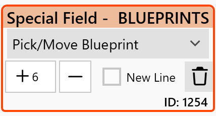
Available Args
Default Args:
ShowAs: Path; OnChange: Move; CanSelectNone: Yes;
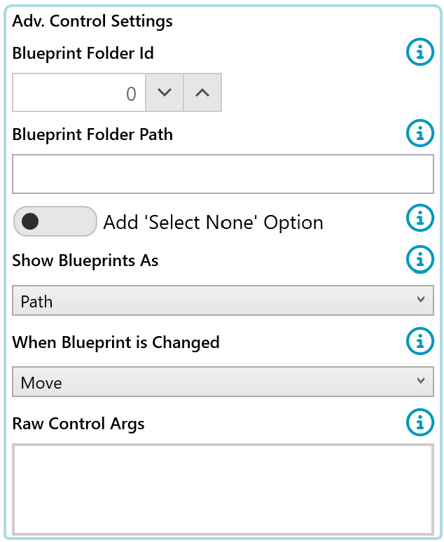
- FolderId:
- [Number] = The FolderId in Blueprint tree to start displaying from.
- Note: if no Folder Id is provided then the whole Blueprint tree will be shown in the dropdown.
- FolderPath
- The folder path in Blueprint tree to start displaying from.
- Note: if no Folder Id is provided then the whole Blueprint tree will be shown in the dropdown.
- CanSelectNone:
- 'Yes': Adds a "Select None" option
- 'No': Does not add a "Select None" option
- Note: If a User is not a member of any of the Blueprints available list then the 'Select None' option will be selected by default regardless of the 'CanSelectNone' arg being set to No.
- ShowAs:
- 'Path': Folder1\Folder2\Blueprint
- 'Name': Blueprint
- OnChange:
- 'Move': If a new Blueprint has been selected then the user is removed from all other Blueprints shown in the dropdown and added to the newly selected Blueprint.
- 'Add': If a new Blueprint has been selected then the user will be added to the new Blueprint. The Blueprints they are currently a member of will not be changed.
Example Args
FolderId: 5; ShowAs: Name; OnChange: Add; CanSelectNone: Yes;
FolderId: 10; ShowAs: Path; OnChange: Move; CanSelectNone: Yes;
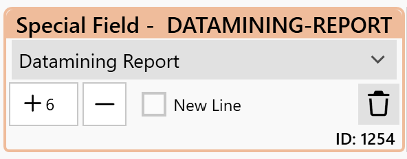
Datamining Report
Inject a datamining report into a portal form Page. The Id from the Survey, i.e. AppId, MigrationId, DeviceId, etc will be used as the data source of the report. This allows reports such as User-App Readiness to be added to a User's Survey.
Available Args
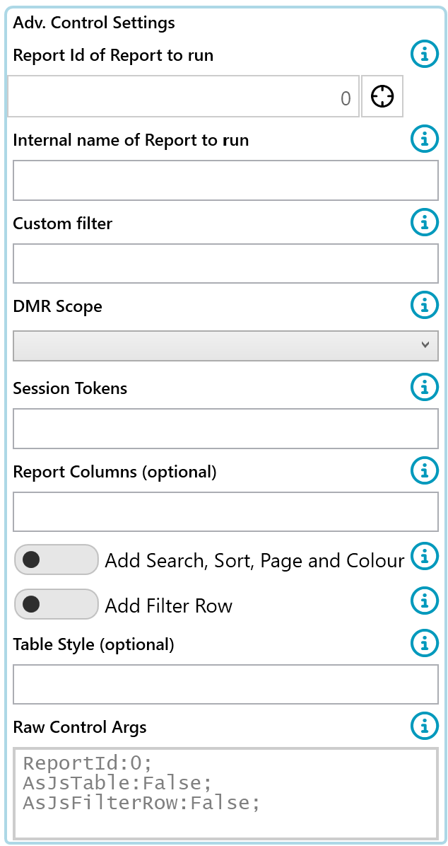
- ReportId
- The Id of the Datamining Report to run
- e.g. ReportId: 7;
- ReportInternalName
- The internal name of the Datamining Report to run
- e.g. ReportInternalName: AppsToUserList_ForMigrationSummarySurvey;
- To set the Internal Name of a DMR
- When saving the DMR
- Tick 'Adv. Options'
- Enter a name in the 'Internal Name' textbox
- You are responsible for making this name unique across the project,
- It is recommended that you use verbose names
- e.g. ReportInternalName: AppsToUserList_ForMigrationSummarySurvey;
- Filter
- Allows a custom filter to be passed to the DMR,
- e.g. Filter: Applications_Process = '7. Live';
- This is the same type of filter as you would set in the Filter Expressions area of the DMR builder
- Filters can contain keywords that are processed before running the DMR
- Use Case:
- You need a Survey that when viewed by a manager can list all of the employees they are resposible for
- You hold a User's manager employeeId in CustomProperty1
- Filter: UserMigrations_CustomProperty1 = [UM_EmployeeId];
- Use Case:
- Note, by default a custom filter is AND'ed with any existing filter a DMR might have applied
- To replace an existing filter with the custom fitler entirely prefix the filter with **
- e.g. Filter: ** Applications_Process = '7. Live';
- Scope
- There are three different scopes the DMR can run as.
- These scopes determine what items are in scope to show on the report.
- Self (default)
- This option overrides the Data Source of the DMR
- It sets a new Data Source to the one Id the Survey is for (e.g. User Migration ID)
- is e.g. If this is a User survey, and the DMR is a User-App list, this will only use the User-Apps of the person the Survey is for.
- DMR
- This will use the DMR's Data Source as set in the report builder.
- e.g. If the DMR is set to show only a Blueprints work of items, those items will be shown on the Survey, regardless of which user the Survey is for.
- All
- This option overrides the Data Source of the DMR
- It sets a new Data Source to All items, e.g. All Applications
- Self (default)
- Examples
- Scope:Self;
- Scope:DMR;
- Scope:All;
- Session Tokens
- When coupled with a Session Token on the Survey, it is possible to feed the Session Token Ids into the DMR as the list of Ids to run the report on.
- The SessionToken setting overrides the Scope setting
- Example
- SessionToken: MySessionToken;
- Where 'MySessionToken' Is the Internal Field name of a Session Token control
- SessionToken: 999;
- Where '999' Is the Field Id name of a Session Token control
- SessionToken: MySessionToken;
- Columns
- Optional. A list of Columns from the Datamining Report to display
- This can not add columns are not already a part of the DMR
- e.g. Columns: Expression_ScheduleUser, Expression_FullName, UserMigrations_DeployUnitSlotStart;
- Table Style
- Optional. html style to inject into the style tag of html table
- e.g. TableStyle: table-sm;
- More Info
Examples:
ReportId 10;
"** Applications_Process = '7. Live'
ReportInternalName: Device_Basic_Info;
SessionToken: DevicePickerTokens;
TableStyle: table-sm;
Pick DeployUnit
Allow a user to select their Deployment Unit or to move to another.
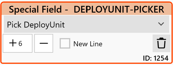
There are a set of optional Special Control Args:
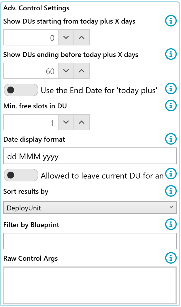
- MinFreeSlots
- The number of free slots that must be left in the DU for it to show in the dropdown
- Default: 1
- ShowFromTodayPlus
- The DeployUnit Start (or End) Date must be greater than or equal to, today + X Days. Negative numbers are supported to support DU's with a start date in the past.
- Default: 0
- ShowToTodayPlus
- The DeployUnit Start (or End) Date must be less than or equal to, today + X Days
- Default: 60
- FilterOnEndDate
- When using the ShowFromTodayPlus filter above the default is to use the DU's StartDate. Use this option to use the DU's EndDate
- Default: false
- DateFormat
- Format how the Start/End dates are displayed in the dropdown
- Default: dd MMM yyyy (e.g. 12 Feb 2024)
- AllowMoveDU
- If the User is already in the DeployUnit, allow them to change their DU to a new DU
- Default: false
- SortBy
- Sort the DU's displayed in the dropdown one of three ways
- DeployUnit - Sort by the DeplyUnit Name (default)
- StartDateUp - Sort by the StartDate assending
- StartDateDown - Sort by the StartDate decendeing
- Default: DeployUnit
- FilterByBlueprint
- Filter the DeployUnits shown to only those in this Blueprint Path
- e.g. "FilterByBlueprint: Migrations \Department\IT\Jan-Feb Migrations"
- Default: no filter
MinFreeSlots:5;
ShowFromTodayPlus:5;
ShowToTodayPlus: 45;
FilterOnEndDate: false;
DateFormat: dd/MM/yyyy;
FilterByBlueprint: Migrations \Department\IT\Jan-Feb Migrations";
AllowMoveDU: True;
SortBy: DeployUnit;
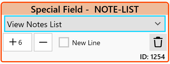
Notes List
Add a list of Notes from the Application, User, Device, etc. By default notes on an item are 'private'. This means those notes will not show on the Survey.
Available Args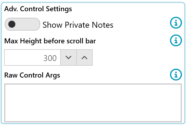
- MaxHeight
- The number of pixels in height before a scroll bar is shown
- Default is 300 which shows approximately two notes.
- Setting the value to -1 will remove the scroll bar altogether.
- e.g. MaxHeight : 300;
- ShowPrivateNotes
- Setting to true will force Public and Priave notes to show on the Survey
- e.g. ShowPrivateNotes : True;
MaxHeight: 500;
ShowPrivateNotes: True;
Blueprint List
Adds a list of Blueprints for an Application, User, Device, etc to the Survey.
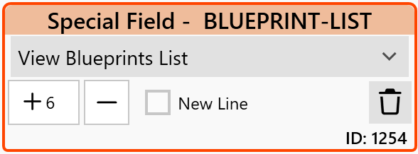
Available Args
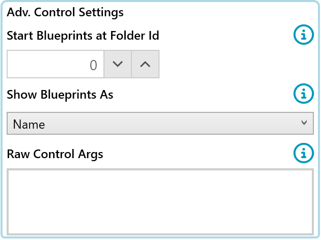
- FolderId:
- [Number] = The FolderId in Blueprint tree to start displaying from.
- Note: if no Folder Id is provided then the whole Blueprint tree will be shown in the dropdown.
- ShowAs
- Toggles between the full Blueprint Path / Blueprint Name
- e.g. ShowAs : Name;
ShowAs: Name;
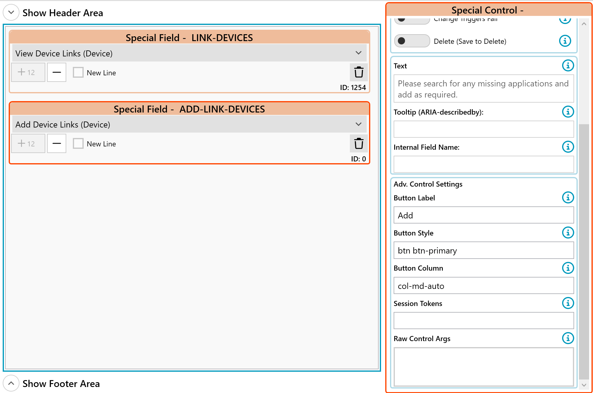
Link Tables
Displays a table of links, e.g. List of Apps for User, List of Devices to User. The special text field will display as the header text above the table of links. The table will be sorted alphabetically by the left column first and each column to the right thereafter.
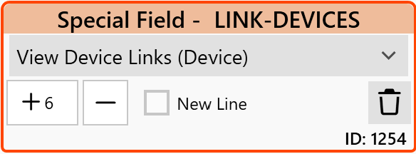
Field Settings: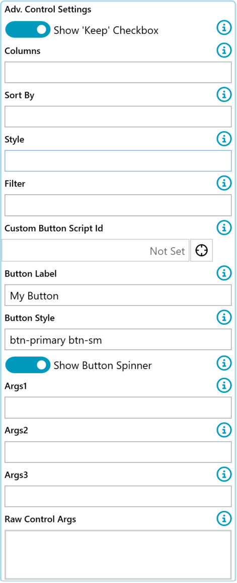
'Keep' Checkbox
When displaying the list of e.g. Apps for a User or Devices for a User a checkbox titled 'Keep' is displayed next to the listed item. This allows users to untick that item and have it removed from their profile.
e.g. A User can unselect all the Applications they do not use.
To Hide this check box add the arg ' AllowRemove: No; '
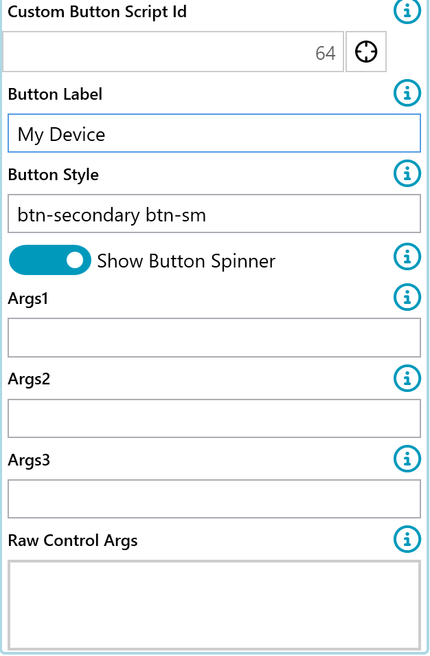
Custom Button
A Custom button is available to hook into and will be displayed next to the listed items. This allows custom functionality such as allowing a user to select a specific device and have that flagged as their main device for migration.
To use this custom button provide a 'CustomButtonScriptId : XX' where XX is the Id of the PowerShell Script to call. The script will be provided the Id of the active User, App, Device etc in the $ScriptArgs.Items and the Id of the selected item in the $ScriptArgs.AltItems
Available Args
Default Args:
Columns:AppVendor, AppVersion, AppName;
AllowRemove: Yes;
CascadeRemove: Yes;
CustomButtonScriptId: 99;
CustomButtonLabel: My Button Label;
CustomButtonStyle: btn-secondary btn-sm;
- Columns:
- List of columns to show in the links table. Uses internal default if none specified.
- AppVendor, AppVersion, AppName
- Default: AppVendor, AppVersion, AppName (or equivalent for the item)
- List of columns to show in the links table. Uses internal default if none specified.
- AllowRemove:
- Shows a checkbox beside the link that allows a user to 'Reject' the link
- 'Yes': Shows the remove checkbox
- 'No': 'Does not show the remove checkbox.
- Default: 'Yes'
- CascadeRemove:
- Rejects all links for this item. e.g. If rejecting 'Adobe Reader 7', it will reject all links 'Adobe Reader 7' if present on more than one device. However, if a user rejects a device it would reject all apps linked to that device.
- 'Yes': Will cascade the reject action.
- 'No': Does not cascade the reject action.
- Default: 'Yes', however, it is recommended to change this to 'No' for Device Surveys.
- SortBy
- Sorts the list by a column, e.g.
- "SortBy: AppVendor, AppName, AppVersion;"
- Note: The columns that are being used in the Sort must be in either the selected Columns list or the Filter list.
- Sorts the list by a column, e.g.
- Style
- Override the default bootstrap style applied to the table
- Default: 'table-sm table-bordered'
- e.g. Stripped rows: Sty;e: table-striped
- More Style Examples: https://getbootstrap.com/docs/4.0/content/tables/
- Filter:
- Filters the table of items shown on the survey.
- All the field names found on the 'Grid Config' page of the item's admin tab can be used
- Use the 'Internal Name' value
- e.g. AppVendor, ProcessStatus
- Use the 'Internal Name' value
- Supports
- And
- Or
- =
- <>
- 'Like' with '%' as wildcards
- 'IN (1, 2, 3)' e.g. ProcessId IN (7, 3, 6)
- Grouping by brackets
Pro Tip: Adding a scroll bar to the Link Table
Add the below CSS to the Survey and replace the 'XXX' with the FieldId of the Link Table
#survey-group-id-XXX {
  max-height: 300px;
  overflow: auto;
  display:inline-block;
}
Custom Button Example
Create a custom button for a User's Device list that when selected will write the Hostname of the selected Device to a Custom Field. A use case would be asking the User for the main device that they need to migrate. Please refer to this article for more information on creating a Custom button in a survey.
- Create the PowerShell Script
- Add the Custom Button to the Link-Devices
PowerShell Script

Link-Devices configured to show Custom Button
Output on Survey

Filter Examples:
Is in Process A, B or C
Filter: Process = '1. Identified' OR Process = '2. Discovery' OR Process = '3. Packaging';

Is in Process A or B and not Package Type C
Filter: (Process = '1. Identified' OR Process = '2. Discovery') AND PackageType <> 'MSI';

Is from Vendor A and in Process B
Filter: AppVendor like '%Adobe%' AND Process = '2. Discovery';

Has Flag A set or in Process B
Filter: CustomFlag1 = true  OR Process = '2. Discovery';

ProcessId is in a specific list of Process Ids
Filter: ProcessId IN (7, 3, 6);
More Examples:
Columns: AppVendor, AppName, AppVersion;
Filter: ProcessId IN (7, 3, 6);
SortBy: AppVersion
Add [Module] Links
Available special controls:
- Add Application Links
- Add User Migration Links
- Add Device Links
- Add Mailbox Links
- Add Bespoke Links
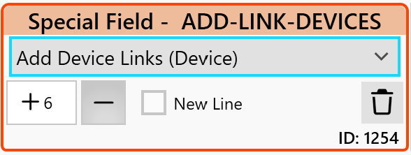
Add an option to a survey where the module can be searched (eg. for an application name) and added as a link.
This control is very useful for a user survey where an existing application is not linked to a user, but there's a requirement to offer the user the option to search for, and link new applications to their User Migration record.
It's suggested that this option is used in below the Links Table field so that any newly added items are displayed in the Links Table as they are added. This also gives the user the option of removing that item if they made is mistake in adding it.
Available Args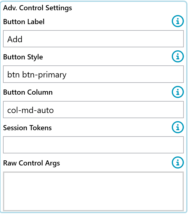
Setup:
Resulting survey:

Script Button
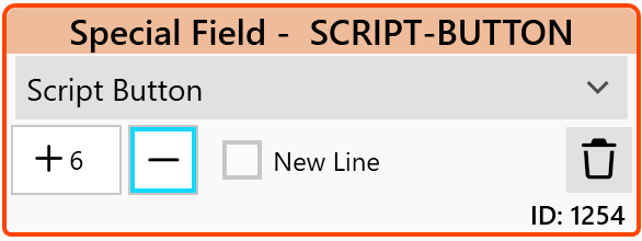
Adds a button to the form that can call a PowerShell Script and then reload the page after the script is finished executing. This allows for custom functions such as calculating a value based on some previous questions or looking up a user in AD and retrieving some information on them.
Use the 'Special Control Text' to set the label of the button shown on the Survey.
Note
- When as script button is clicked, all data on the survey is saved, the script is run and the page reloaded.
- Events such as survey passed/failed or sending emails do not fire.
- Script buttons do not trigger field validation when clicked
Available Args
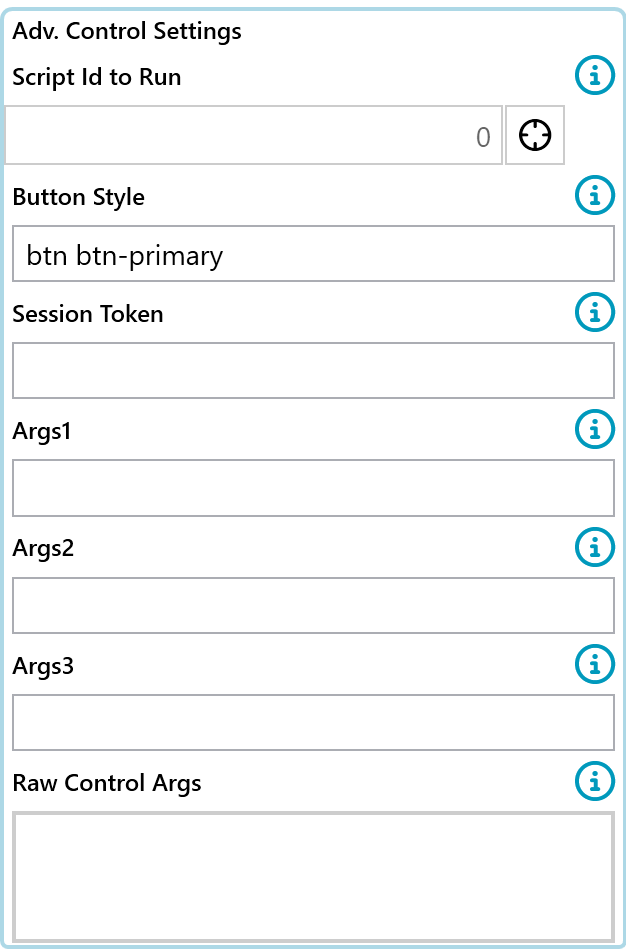
- ScriptId:
- Script Id to execute. The script will be passed the Instance Id of the active page.
- Args1 , Args2, Args3:
- Values are passed into the called script in the EventArgs1,2,3 fields
- Style:
- Sets the button style, default is "btn btn-primary"
- eg: Style: btn btn-warning btn-block;
- https://getbootstrap.com/docs/4.0/components/buttons/
Show / Hide
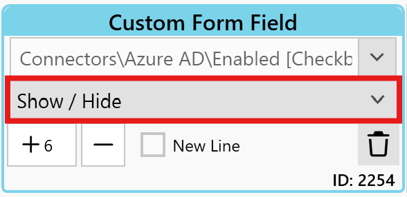
Allows Fields on the Survey to be hidden until a checkbox has been ticked. This is used to simplify the look of complex forms. E.g. Hide a group of accessibility questions can be hidden until a user ticks a box marked 'Accessibility Requirements'.
The Show / Hide control must be paired with a checkbox or Dropdown field of a custom form.
The checkbox/Dropdown is used to trigger the show/hide event. This is the only line that requires the "Show\Hide" Special Control assigning for the show hide group.
The Field Ids to hide\show are the Survey IDs in the survey designer, they are NOT CustomField Id's from the custom form screens.

Available Args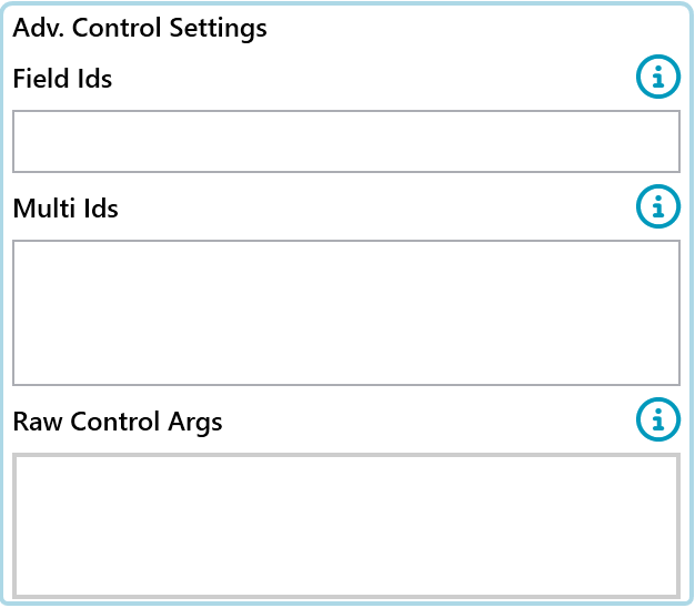
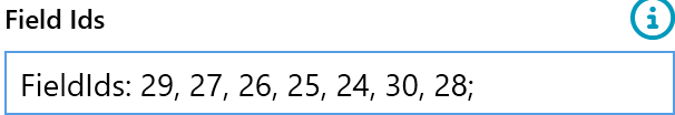
- FieldIds:
- List of Field Ids of controls to hide on the form.
- E.g. 10, 11, 12
- List of Field Ids of controls to hide on the form.
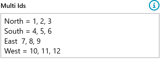
- Multi ids
- The value from the dropdown trigger on
- The list of ids to show
Checkbox Examples:
List the field ids to show if this check box is ticked. If it is not ticked then these field Ids will be hidden.
Dropdown or Radio Button Examples:
List each item in the dropdown on a new line with Ids of fields to show if that item is selected. Note all other fields will be hidden. Terminate each line with a ';'
North: 1, 2, 3;
South: 4, 5, 6;
East: 7, 8, 9;
West: 10, 11, 12;
If Dropdowns or Radio Buttons are to defined it may be necessary to also user FieldIds: as before a Dropdown or Radio Button is selected all fields will be turned on.
In the example above the following may also need to be added.
  FieldIds: 1,2,3,4,5,6,7,8,9,10,11,12;


Attachments Uploader
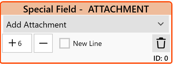
Allows files to be attached to the Survey. These can be used to gather additional requirements such as screenshots.
Control Switches Support:
| Required | Read Only | Change Triggers Fail | Visible | On New Line | |
|---|---|---|---|---|---|
| Textboxes | Yes | Yes | Yes | Yes | Yes |
| Dropdowns | Yes | Yes | Yes | Yes | Yes |
| Radio Buttons | Yes | Yes | Yes | Yes | Yes |
| Listboxes | Yes | Yes | Yes | Yes | Yes |
| Checkbox | Yes | Yes | Yes | Yes | Yes |
| Checkbox List | No | Yes | Yes | Yes | Yes |
| Star Rating | No | Yes | Yes | Yes | Yes |
| DeployUnit Picker | Yes | Yes | Yes | Yes | Yes |
| Blueprints | No | Yes | Yes | Yes | Yes |
| Links | No | Yes | Yes | Yes | Yes |
| Show / Hide | No | No | No | Yes | Yes |
Tweaks and Options
Checkboxes
By default, the text label of a checkbox is moved to the right of the checkbox rather than above it like most other controls. This can leave a gap above the checkbox that can look out of place. Text can be added to the 'Special Control Text' field of the checkbox and this text will appear above the checkbox to fill in the gap.
Further Support
If you require further support, please visit ManagementStudio's Service Desk to search the knowledge base or create a new support ticket.
Was this article helpful?
That’s Great!
Thank you for your feedback
Sorry! We couldn't be helpful
Thank you for your feedback
Feedback sent
We appreciate your effort and will try to fix the article